During this month, which we will call ” online marketing month “, we will talk about marketing strategies focusing mainly on developing an online presence when it comes to reaching potential customers. There is a reason for that. We are already in 2013, nothing will arrive in 2014, after 2015, after, well, you get the idea. Time is moving forward, not backwards, and the technological world is constantly advancing. It is becoming increasingly crucial to present yourself and your activities both online and offline.
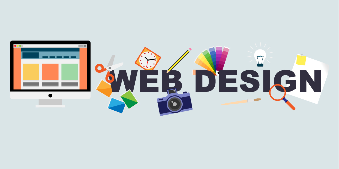
Today we will talk about a way in which you can improve your online presence: improving your website. After all, this is where future customers, even current ones, will go to know more about your activities, your services and about you. It is often the first impression that counts. That is the moment when your customers will decide whether or not you are worthy of their trust and their “hard earned” euros. In other words, it can be a “maker” of business or a “destroyer” of business. With this in mind, it is time to design (or redesign) your website with five tips and tricks that will be very useful.
-
Clean Layout
For the uninitiated, the layout is the sorting and placement of all the elements that make up a web page.

Before you select a layout, make sure you are as a business, your brand identity essentially, and make sure you have a marketing plan. Then choose according to the above. And while you may be tempted to start experimenting with some crazy flashy visuals, remember that first and foremost you are a professional with a particular profession (a medical professional, for example) and your website should represent just that. Look for a clean layout, not boring or heavy, that is simple and classy and irresistible. An attractive display in the design captures the attention of visitors and maintains it. It is what encourages visitors to continue exploring within their website.
-
Balanced Design
Do you know the quote from Seneca: “All virtue is based on the measure”? Well, this applies to your web design too. Too many colors, too many interactive features, too many types of letters, too many of anything, can really throw away the aesthetics of your website. So focus on balance. Choose a color for the text that fits well with the background color (a black text on a white background is certainly the most readable); Choose a font (and maybe a header style) that captures your personality but is also easy to read, and use images and videos to attract and captivate, not overwhelm. And, please, for what you most want, never use the comic sans font or any other super stylized,
-
Organized Content
The ultimate goal of your website is to communicate to your audience relevant and well-written information about your activities and the sector where you are an expert. While the appearance of a web design receives the visitor, it is the content that keeps it close. A web design may look fantastic but unless it presents attractive content, it will be meaningless. Among the best practices for the content we can name:
- Use large and attractive headings and short paragraphs separated by subheadings and dotted lists.
- Categorize and display the content so that it makes sense to the new visitor.
- Be consistent in presenting the content.
- Create quickly accessible content with as few clicks as possible.
We should also point out that there is nothing worse than outdated information on your website. You will never want to advertise on your website services, prices, times or addresses that are no longer valid or accessible. In addition, content that seems outdated or expired may make potential customers think that your business no longer exists. We recommend a thorough visit to your website at least once a month to ensure that all the information and services you offer are in place.
And, since we’re talking about content, make sure you have the look of covered web positioning.
-
Easy Navigation
You have already chosen the layout, created a balanced design and organized its content. Now is the time to consider how your audience will move within your website. Without simple navigation and accessibility, a website is just a “nice” site. Navigation acts as a map, directing visitors through the site based on their interests.
According to the Search Engine Watch article called ” 25 Design Best Practices for your Small Business Web Site ” you can achieve easier navigation for your audience by placing the content that you consider most important (including calls to action such as registration Or user log in) at the top of the fold (the part of the page that is seen immediately without having to use the sidebar to go down) Why? Because they will often not come down, and if they do, they may have already lost their attention. The more it costs a reader to access information, the less likely it is that they will.
It is also advisable to create a static site map with descriptive text that includes all corners of your website so that visitors can find the site they want to go next. And, speaking of finding things, be sure to provide your audience with “self explanatory” tabs and how to get back to your home page, such as by putting a link in your company logo.
-
Functioning Of The Characteristics
The latter should be overlooked but just in case: Make sure your website works, links and everything. This means performing regular maintenance and quality checks as well as asking and feedback with your audience. The operation also refers to how the website works on the various browsers, operating systems and mobile devices. It should work perfectly and look wonderful in both old and new versions of browsers and be mobile-friendly. Allow me to insist on mobile devices: In 2012, the percentage of Internet users accessing mobile / ubiquity with mobile device (45.1%) is higher than that of laptop users (35.4%), compared to 26% and 31%, 4%, respectively, in 2011. So while you are developing and designing your website, do not forget to check that it works in different browsers and operating systems. After all, what looks wonderful in Mozilla may look awful in Safari or even floppy on an IPhone.
There You Have It: Five tips and tricks for a better web design. There are certainly many more. Google has a lot of documentation on this topic. But before you go look for it, we’ll give you one more tip: Hire a web designer. Believe me, hiring an expert involved from the beginning is worth the money invested. Just think about the amount of headaches you will save throughout the entire process.