
For this blog post we decided to write another web design spotlight! Our last blog post covered simplicity in web design and what makes simple things work for effective websites. You can check out that post right here. While we aren’t going to exclusively talk about simplicity for this post we are going to keep with that theme. The web design principle we’ll be taking a look at today is known as the F-layout.
The F-layout is a website layout that is based upon studies that show website users read the screen on their computers in an “F” pattern. When first looking at a new web page the users eyes will typically drift to the top upper left corner of the screen, their eyes then scan across to read the top section of the webpage where the categories buttons are found. Then their eyes move down the left side to read whatever content is filling the page and across from the left side to analyze the rest.
This is essentially the same way people read any sort of text, whether it is a book, newspaper, email, or anything else. The F-layout is a layout that allows users to take in the contents of the website the way they are naturally inclined to. People don’t read websites that way because that is how websites have been built over time, they read it that way because that is how they been reading things since they were 4 years old.
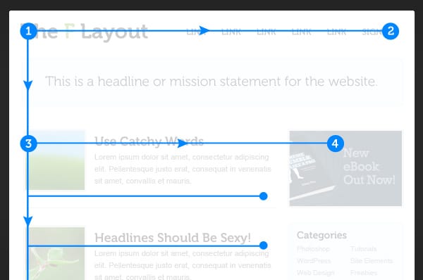
Here is a basic example from Web Design Tuts of what an F-layout page would typically look like with an actual webpage. Notice how the pictures for the second row of content align to the left side as well. Users eyes will always avert to pictures before smaller text, by placing the pictures where they are attention is still be brought to the written content next to it.
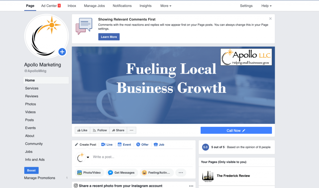
Facebook is a great example of a real F-Layout pattern in action.
Even though people’s eyes will typically drift in the fashion the F-layout provides, it is important to note that the F-Layout isn’t the end all be all of web design. If every single website was made to abide strictly to the F-Layout then the internet would be a pretty boring place. What is more important is to take the concept that the F-layout is built upon and be sure to incorporate them appropriately in to your own website.
The concept mainly being that important information should always be at the top of your page so that users take notice of it before they start scanning the rest of the page. No one is going to read every letter of every website so it is important that the content that you want to be seen is put in the place that it will be seen the most.
For example, a particular website may not be designed with the F-Layout but you’ll surely always notice their logo or call to action up near the top left of the screen. The other items of content put towards the top left of the screen should also be interesting and engaging to drive the user to continue reading further.
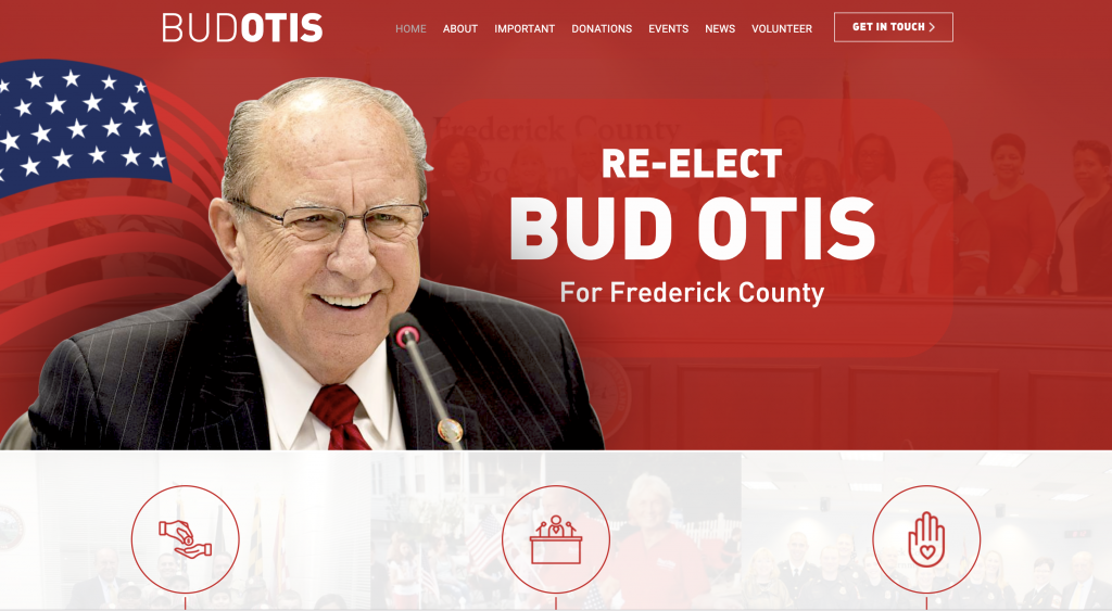
For example, here is the website we built for recent Frederick County Council candidate Bud Otis. We didn’t abide strictly by the F-layout for this website but you will notice some of the concepts at play.
Like we said, the F-layout isn’t the one true way to do web design in to 2019. It can be pretty basic and bland. If you’re just getting started though and looking to understand the foundational basis of what makes a good website then it is a good place to start.
If you’re looking to learn more about good web design practices or want to do a complete overhaul of your website give us a visit at https://apollollc.com//.